
A dashboard should not just display numbers. It should tell you whether your system is working.
The Problem with Most Dashboards
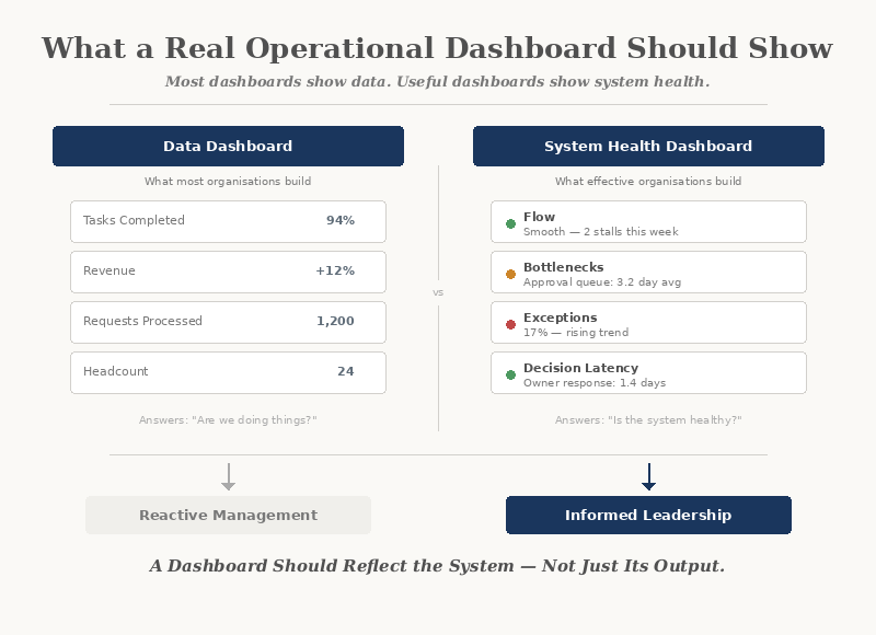
Most operational dashboards are built around data — revenue, task counts, completion rates, throughput volumes. These numbers feel reassuring. They look professional. And they are almost always insufficient.
The reason is simple: data describes outputs, not behaviour.
A dashboard showing high completion rates says nothing about:
- How long work waited before it started
- Where decisions stalled
- How many exceptions were handled informally
- Whether the process is stable or under strain
Numbers that look healthy can mask a system that is quietly deteriorating.
Data vs System Health
There is a fundamental distinction between reporting on data and reporting on system health.
Data dashboards show:
- Volume and throughput
- Task completion
- Revenue and costs
- Headcount and capacity
System health dashboards show:
- Flow and friction
- Bottlenecks and queues
- Exception rates
- Decision latency
Data tells you what happened. System health tells you why it happened — and whether it is likely to happen again.
What a Useful Dashboard Actually Shows
An operational dashboard designed around system health answers a different set of questions entirely.
Flow
How is work moving through the system? Where does it accelerate, and where does it stall? Flow reveals the rhythm of operations — and disruptions to it become visible before outcomes are affected.
Bottlenecks
Where is work accumulating? Bottlenecks are not always obvious. They often hide in handoffs, approvals, and waiting states — the spaces between steps that no one owns.
Exceptions
How often does work leave the expected path? A rising exception rate is one of the clearest signals that the system is under strain — even when output numbers look normal.
Decision Points
Where are decisions being made, and how long do they take? When decisions slow down or bypass the system entirely, it signals structural ambiguity — unclear ownership, missing information, or conflicting priorities.
A dashboard that shows these four dimensions gives leadership a view of the system itself — not just its output.
Why Vanity Metrics Persist
Most dashboards default to vanity metrics because they are easy to collect and reassuring to report.
- "We completed 94% of tasks this month"
- "Revenue is up 12%"
- "We processed 1,200 requests"
These numbers answer the question: "Are we doing things?"
They do not answer: "Is the system healthy?"
The Questions a Dashboard Should Answer
Before designing any dashboard, an organisation should define the questions it needs to answer. Not "what data do we have?" but "what do we need to understand?"
If a dashboard cannot answer these questions, it is reporting on activity — not on operations.
Designing for Visibility, Not Volume
Effective dashboards are not built by adding more charts. They are built by choosing the right signals.
The principles are straightforward:
- Show flow, not just totals
- Show waiting time, not just processing time
- Show exception rates alongside completion rates
- Show ownership and handoff clarity
- Show trends, not just snapshots
A well-designed dashboard surfaces problems before they become crises. It gives leadership the ability to intervene early — not after the damage is done.
The Human Layer
No dashboard replaces human judgement. But a good dashboard informs it.
When people can see how the system is behaving:
- Conversations shift from blame to diagnosis
- Decisions become evidence-based
- Teams align around shared reality
- Leadership can act with confidence
When the system is invisible, people rely on instinct, anecdote, and escalation. When the system is visible, they rely on understanding.
The most powerful thing a dashboard can do is create a shared language for how the organisation actually operates.
Where AI Fits
AI can enhance operational dashboards — but only when the underlying system is already understood.
Used well, AI can:
- Detect patterns in exception rates
- Predict bottlenecks before they form
- Surface anomalies that humans would miss
- Recommend where to investigate
Used prematurely, AI adds noise to an already unclear picture. The system must be visible before AI can add value to it.
From Dashboard to Decision
A dashboard is not an end in itself. It is a tool for better decisions.
The real test of any dashboard is not how it looks, but what it enables:
If a dashboard does not change how decisions are made, it is decoration.
Closing Reflection
A dashboard should be a window into the system — not a mirror reflecting what leadership already believes.
The most useful dashboards are not the most complex. They are the ones that show the right things — flow, friction, exceptions, and decisions — clearly enough to act on.
When the system becomes visible, better decisions follow naturally.